UX Principles in Portal 2
Elements of UX Guidelines &
Subtitle Accessibility Study
Project Background
Portal 2 is a puzzle platform game that has garnered critical acclaim for its gameplay, story, and characters.

But what factors contributed to creating an enjoyable user experience?

To answer that, I examined how UX principles are present in video games, using Portal 2 as a test subject.
Analysis Summary
After identifying 13 elements that demonstrate 7 UX principles, I concluded that the game communicated interactions, information, and feedback in a manner that served to positively optimize the player experience.
Full UX Analysis
In the second half, I was concerned with accessibility principles for subtitles and captions.

For this, I tried solutions to increase readability with surveys using screenshots and usability tests.
See Edited Captions
Though the changes would need more in-depth research and testing with participants who are deaf or hard of hearing, 100% of participants said they found marked improvements in readability.
Watch Demo Clips
Research Plans
Main Objectives
  1. Play the first 60 minutes of gameplay.
  2. Identify game elements that demonstrate usability heuristics.
  3. If concerns for usability are identified, think of solutions to reduce potential pain points (while considering the game team’s constraints like time, money, and technical feasibility).
  4. Test solutions as needed.
Research Plans
In the initial testing plan, I had wanted to do in-person playtests with recruits who had never played the game before, using my Xbox One console.

For remote options, the plan was to have recruits on PC stream and share their screen.
Initial Test Plan
Alternative Plan
However, after careful planning, consideration of logistics for remote playtesting and recruiting, and health concerns, I decided to take the alternative route:
  1. Conduct an evaluative self playthrough for 60 minutes;
  2. Identify elements that demonstrate usability principles;
  3. Supplement with first-time playthrough streams on YouTube.
Revised Test Plan
60-Minute Playthrough
Returning Test Subject
Since I hadn't played the game for 7+ years, I had decided that my own play-through could slide (though not entirely ideal).

The important thing was to play the game as a player, not as a designer or researcher – just have fun!  

After the 60 minutes was up, I went back and reviewed the recording.
Full Playtest Notes
7 Noted Usability Principles
Though there were many observations to make, each game element does not necessarily fall into only one category, as there was a lot of overlap; nor are these seven principles the hard and fast rules.
  • Signs & Feedback
  • Processing & Perceiving Information
  • Form Follows Function
  • Consistency
  • Cognitive Load
  • Error Prevention & Recovery
  • Flexibility
The following sections will be grouped into fours, by game element and the principle they show.
Elements #1-4
Overview
  • Save Screens
  • Loading Screens
  • Dotted Paths + Symbols
  • Portal Trackers
1) Save
Error Prevention & Recovery:
  • Pre-game reminder and notification;
  • Reassurance of progress saved at important checkpoints and accomplishments.
  • Before exiting, extra layer of confirmation needed to avoid accidental quits.
  • In-game saves could fall under Feedback: System Status.
2) Loading Screens
Feedback: System Status
  • Dotted progress bar (bottom right);
  • Color change for successful confirmation.
3) Dotted Paths + Symbols
Consistency & Perceiving Meaning
  • Like loading screens, blue and yellow confirm success or incompletion.
  • Paired with symbols of checkmark and X for extra visual aid.
Feedback: System Status
  • Change from blue to yellow on successful interaction.
Perceiving Information
  • Indicators (hints) of possible steps to solve the level: where do the paths lead, what are they trying to tell you?
4) Portal Trackers
Feedback: Location & Status
  • Bracketed outlines of active portal locations through walls or corners.
Elements #5-8
Overview
  • Gun Crosshairs
  • Numbered Wall Murals
  • Icon Hints
  • Prompts
5) Gun Crosshairs
Feedback: Status
  • Once the first blue portal is unlocked, the shapes change to two distinct “pieces.”
  • On making portals in a new level, the crosshair fills in with their respective color.
  • Note color change in gun’s center.
Consistency: Controls
Cognitive Load: Reduction
  • LT and RT mapped to crosshair halves.
  • Don't need to remember assigned portal colors; color crosshairs are a constant reminder.
6) Numbered Wall Murals
Feedback: Progress & Location
  • Current progress; indicates overall progress needed (ex. 4/19 Levels).
Feedback: Visual
  • Flickers into place, catching attention (“What’s this?”).
Perceiving & Form Follows Function
  • Icons = warnings or clues.
  • What were the icons trying to convey?
  • Contrasting outlines to indicate which ones will be in the level.
7) Icon Hints
Perceiving: Proximity & Consistency
  • Placed around objects that need to be interacted with; note dotted paths.
  • Matches icons on wall murals.
8) Prompts
Feedback: Inviting Signs
  • Persistent icons with directional arrow.
  • Directing attention to new object - Companion Cube is literally dropped in with the PA explaining usage button presses: “Cube and button-based testing remains an important tool…” 
Elements #9-13
Overview
  • Audio Cues
  • Window Types
  • Wall Types
  • Red Screen Overlay
  • Subtitles & Captions
9) Audio Cues
Feedback, Perceiving, Clarity
  • Beeps, bloops, whirring, clock ticks, and other sounds specific to certain objects give players confirmation of actions. 
  • Sounds for timed interactions imitate the tick of a clock counting down.
10) Window Types
Perceiving + Clarity
  • I got lost in a level, not noticing the difference between glassless vs. cracked glass vs. solid windows - but quickly realized it's a matter of trying different things in the environment.
  • Cracked glass, blurry view = smash through with Companion Cube, or is it totally impassable?
  • Glassless = clear view of room beyond, try going in.
11) Wall Types
Perceiving: Color & Texture
  • Wall texture and color indicate where portals can be created.
  • Smooth light grey walls = portal-ble.
  • Cracked, tiled, dark = no portals allowed.
12) Red Screen Overlay
Feedback: Status
Perceiving: Color
  • Use of red and blurred screen = blood, injury, warning. 
  • Minor question: how many hits can I take before I die?
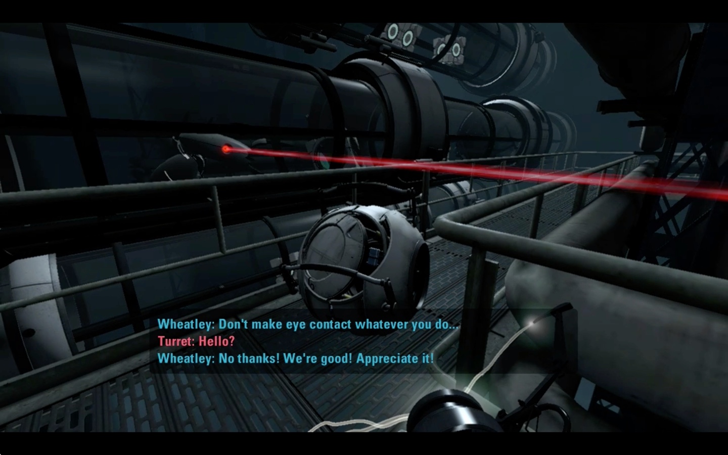
13) Subtitles & Captions
Flexibility: Accessibility
  • Color-coded by character (Wheatley = blue, GLaDOS = yellow).
  • Name of character speaking.
  • Captions include descriptions of sounds and sound cues; helps direct players' awareness of environment, especially if out of their periphery.
General Overview
How Did the Game Do?
I got stuck many times, utterly lost on what to do next.

However, cognitive load isn't a bad thing here, since the main objective is solving puzzles while figuring out a variety of ways to use portals and cubes.
Minimal UI
Though minimal, the sparseness complements the feeling of isolation in a hostile environment, and in the game world, Chell isn't equipped with anything that would help her gauge health or location.

It could also be argued that it's enough to know which objects to avoid interaction with - turrets, laser beams, killer water.
Accessibility Concerns
Subtitles & Captions
While extremely helpful to have subtitles and captioning, I was worried that low-vision and hard of hearing players would miss instructions, cues, and dialogue.
Notes on Structure
  • Large chunks of dialogue and sound cues shown, sometimes blocking prompts.
  • Lower background opacity.
Testing Subtitles
Testing Readability
For many players, subtitles and captions are absolutely necessary, so how can I include as many players as possible by increasing readability? 

How can these potential pain points be alleviated?

I decided to conduct small usability tests for certain parts of the gameplay, by having participants read the subtitles and captions aloud on a muted clip.

For supplementary feedback, I sent out a survey with screenshots of the captions and gathered participants’ responses.
Testing Plan
Findings
Survey
  • 8 Respondents: 100% had issues reading text; 1 participant was red-green color-blind.
  • Issues with contrast, opacity, size of text, amount of text.
  • Text blends in with the background too much and is too small.”
  • "The blue text strained my eyes, far too much text on the screen at once.”
Remote Testing
  • Behaviors: leaning forward and squinting (resulting in irregular, slowed reading rates), pausing.
  • Missed lines; filled in unreadable parts with "Something, something..." 
  • Oh man my eyeballs are having a hard time with this.”
  •  “I just couldn’t read the screen at all in some places.”
Full Findings
Solutions
Objectives
  • Find reviews of games with subtitles and captioning (CanIPlayThat, Gamasutra...);
  • Check Xbox Accessibility Guidelines
  • Check BBC Subtitle Guidelines
  • Gather blank screenshots – add edited captions and subtitles for before and after comparisons;
  • Set edits to blank game clips (find sections from problematic survey screenshots).
Solutions
Before & After Edits:
Multiple Captions & Lines
In one scene, while GLaDOS is speaking, there are many background sounds: doors opening and closing, lights turning on...

I worried that too many would crowd the screen even with a bottom-up slide-in, and prioritized sounds by how meaningful they were to context. 

In the sample screenshots below, I decided that the most important cue was the [Dropper Door Opening], as its function is to drop an important tool in solving the level - the discouragement redirection cube.
Demo Video Clips
Note About Demo Clips
One limitation when manually adding text in VLC was: there wasn't a way to add subtitles in from the bottom; so the demo clips don't follow the guidelines perfectly.

A rough demo of how I wanted text to slide in:
View Transcripts
Checking Solutions
Comparison Survey
Even though I felt that some improvements were made, I still needed some form of validation, which is better than just my own assumptions.

I will note, though, that test participants really should have been players who are deaf or hard of hearing.

I sent another survey with before and after screenshots for a quick overview of how people saw and read the edits. Following this, I contacted my previous test participants and ran another test:
  • 100% of participants selected the edits for stronger readability.
  • "More contrast, bigger text, and structure made them easier to read."
Conclusions & Lessons
Portal 2: A Balancing Act
A long time ago, I had played both Portal and Portal 2. I admit I actually hadn't finished Portal 2 at the time, but remembered having some misgivings about the series being a puzzle game ("What?! I have to think?").

Shortly into the first game, I was totally absorbed - and at the end of the play test years later, I nearly ignored the 1-hour timer.

Personal story aside, I felt that Portal 2 made effective use of UX principles to create an engaging experience, blending challenges with ways to guide players, as well as encouraging various methods of interactions.
More Opportunities & Learning
In the second half of the analysis, I focused on accessibility principles.

Though implementation was often challenging, it was absolutely worth it when thinking about how even small changes could remove barriers.

In the future, I hope to study and learn more about motor, cognitive, and visual considerations for product design, so that more people can enjoy and love video games.